By Snigdha
By Snigdha
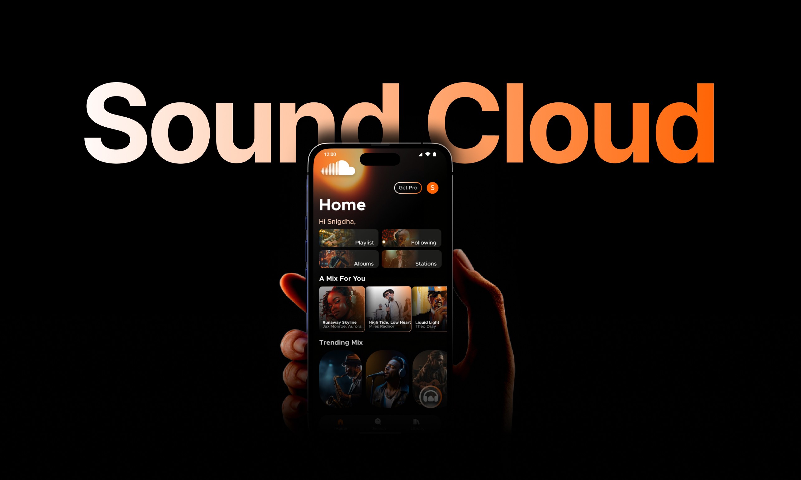
UI/UX Case Study:
Enhancing SoundCloud’s Mobile Experience
UI/UX Case Study:
Enhancing SoundCloud’s Mobile Experience
Redesigning with a focus on rhythm, mood-based discovery, smooth user flow, and support for both light and dark themes.
Redesigning with a focus on rhythm, mood-based discovery, smooth user flow, and support for both light and dark themes.

Context & Intent
This is my very first UI/UX case study, and it’s a product of pure curiosity, effort, and creativity. While I’m not claiming this redesign to be the ultimate solution, I do believe it brings meaningful ideas to the table. The suggestions and design choices reflect what I genuinely think could improve the user experience, but a final verdict would naturally require extensive user testing and real-world data.
The project is rooted in my personal understanding of SoundCloud’s potential and how it stands apart as a platform essentially the “YouTube for music creators.” With that in mind, I set out to elevate its mobile experience for both music lovers and creators. This redesign re-evaluates the flow, introduces dual themes, simplifies discovery through mood filters, and brings clarity to user engagement for creators all inspired by comparative analysis and intuitive thinking.
Project Overview
This case study investigates the user experience (UX) and personalization limitations across four major music streaming platforms like Spotify, YouTube Music, Amazon Music, and SoundCloud. Through comparative analysis, user feedback collection, heuristic evaluation, and design thinking methodologies, the project proposes a redesigned version of the SoundCloud application.
This redesign of the SoundCloud mobile app is focused on improving user experience, visual consistency, and emotional usability. The updated design introduces a dual-theme interface (light and dark), mood-based discovery features, and a more accessible, intuitive navigation system. By integrating Artificial Intelligence (AI) and following UX principles, the solution enhances the discoverability, usability, and creator features of SoundCloud, positioning it as a more intelligent and creator-inclusive platform.
About Me
Hello
Readers!
Hello
Readers!
Hello
Readers!

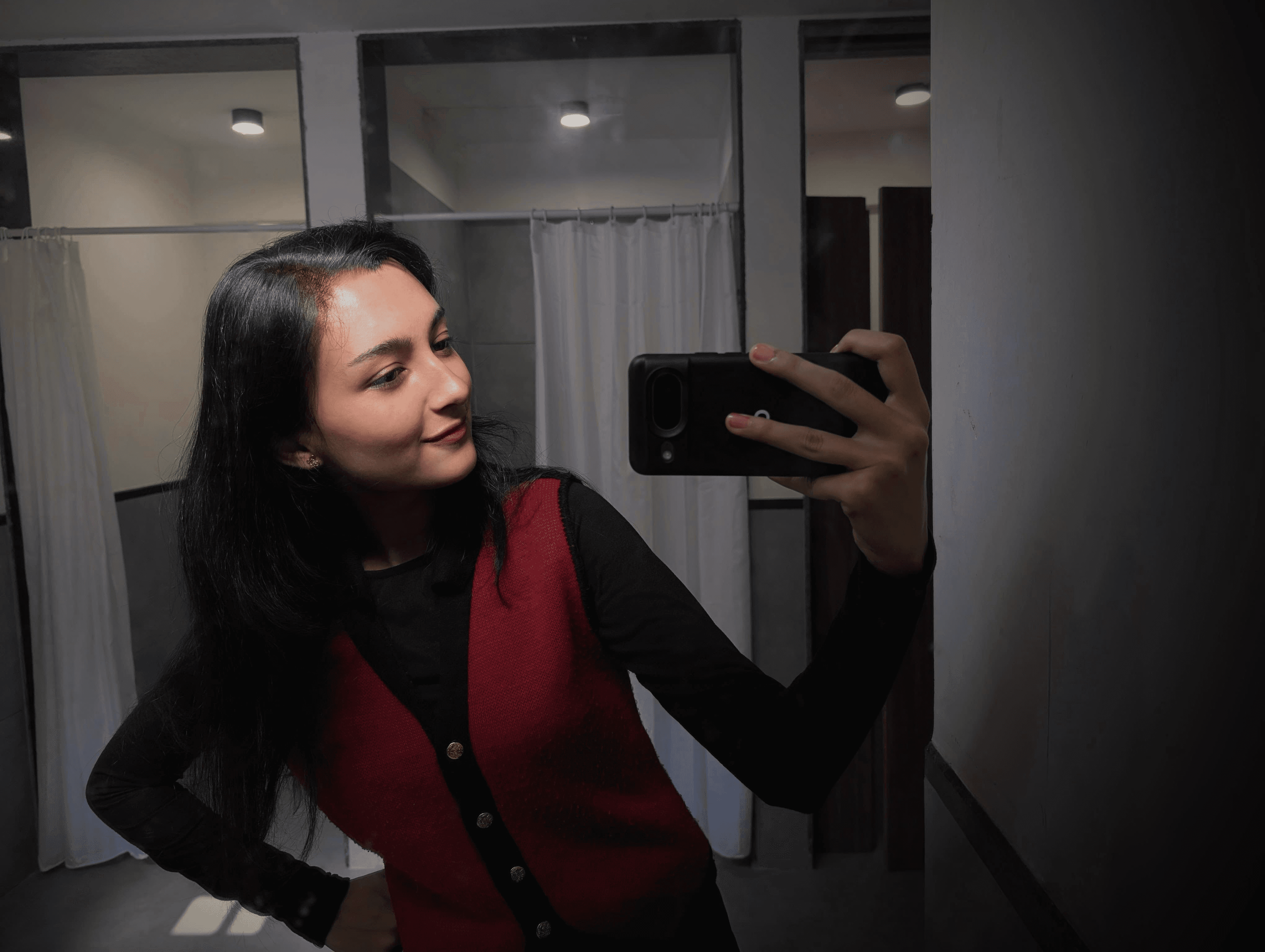
Name
Snigdha Joshi
Name
Snigdha Joshi
Qualification
Computer Engineer
Qualification
Computer Engineer
Design Partner
Art Bee
Design Partner
Art Bee

The Chosen Hues
The Chosen Hues
Let’s skip the fluff…. Here’s the gist.
Pixels & Possibilities
Pixels & Possibilities
I find joy in exploring the digital creative space, whether it’s through design tools like Figma, Framer, Photoshop, Illustrator, or DaVinci Resolve. I also tinker with the basics of HTML, CSS, and JavaScript. For me, design is where imagination meets expression, and I’m constantly finding ways to translate thoughts, moods, and stories into visual experiences that feel intuitive and personal.
I find joy in exploring the digital creative space, whether it’s through design tools like Figma, Framer, Photoshop, Illustrator, or DaVinci Resolve. I also tinker with the basics of HTML, CSS, and JavaScript. For me, design is where imagination meets expression, and I’m constantly finding ways to translate thoughts, moods, and stories into visual experiences that feel intuitive and personal.
Why This Project Exists
Why This Project Exists
Instead of listing out every detail, I’d rather walk you through how I approach design with intention, curiosity, and a little creative spark. This space is dedicated to an experience I reimagined one that reflects how I think, create, and care about emotional, intuitive, and expressive design.
Instead of listing out every detail, I’d rather walk you through how I approach design with intention, curiosity, and a little creative spark. This space is dedicated to an experience I reimagined one that reflects how I think, create, and care about emotional, intuitive, and expressive design.
Powered by Curiosity (and ArtBee)
Powered by Curiosity (and ArtBee)
Every pixel you see here is backed by curiosity, caffeine, and my ever-creative sidekick. This redesign reimagines SoundCloud in a way that (I hope!) feels more expressive, more usable, and more human. So, here’s to building flows that feel right and designs that sound like you.
Every pixel you see here is backed by curiosity, caffeine, and my ever-creative sidekick. This redesign reimagines SoundCloud in a way that (I hope!) feels more expressive, more usable, and more human. So, here’s to building flows that feel right and designs that sound like you.
Problem Statement
While SoundCloud is known for supporting independent creators, the app experience didn’t quite live up to its creative spirit.
Key pain points:
Lack of light/dark mode adaptability
Flat and outdated visual language
Limited emotional or mood-based content discovery
No personalization in onboarding or home screen
Navigation was cluttered and not flow-friendly
Goals
Implement light and dark themes to support different user contexts
Introduce mood-based discovery filters
Redesign key flows with user-centric hierarchy
Develop a minimal but flexible design system
Improve emotional connection through playful UX cues
Implement light and dark themes to support different user contexts
Introduce mood-based discovery filters
Redesign key flows with user-centric hierarchy
Develop a minimal but flexible design system
Improve emotional connection through playful UX cues
Design Inspiration & Moodboard
To set the right tone and visual identity, I explored:
Music-focused design themes
Mood-driven color palettes
Visual rhythm in layout
The moodboard helped maintain consistency across UI components, screen compositions, and emotional undertones.
To set the right tone and visual identity, I explored:
Music-focused design themes
Mood-driven color palettes
Visual rhythm in layout
The moodboard helped maintain consistency across UI components, screen compositions, and emotional undertones.

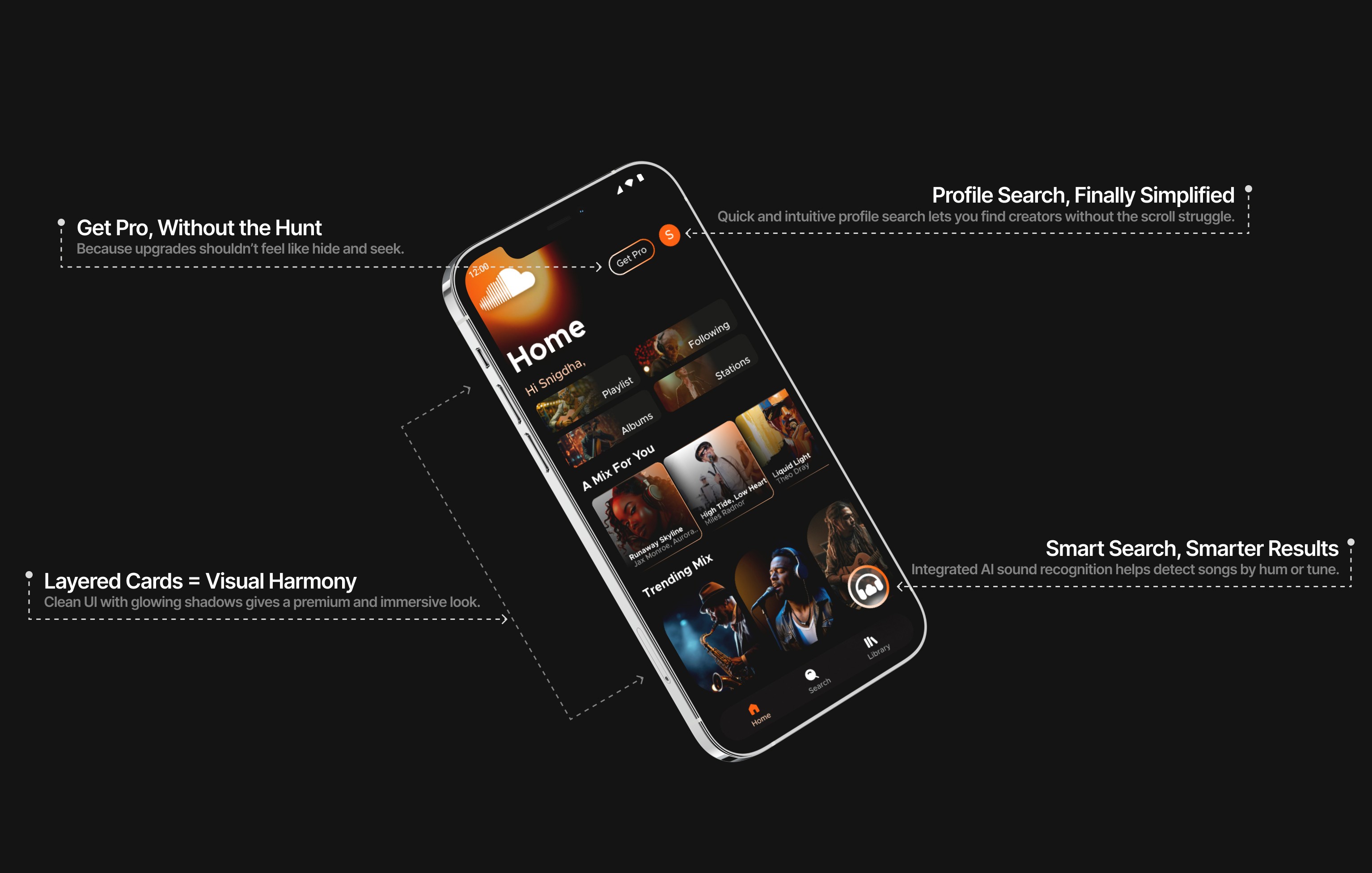
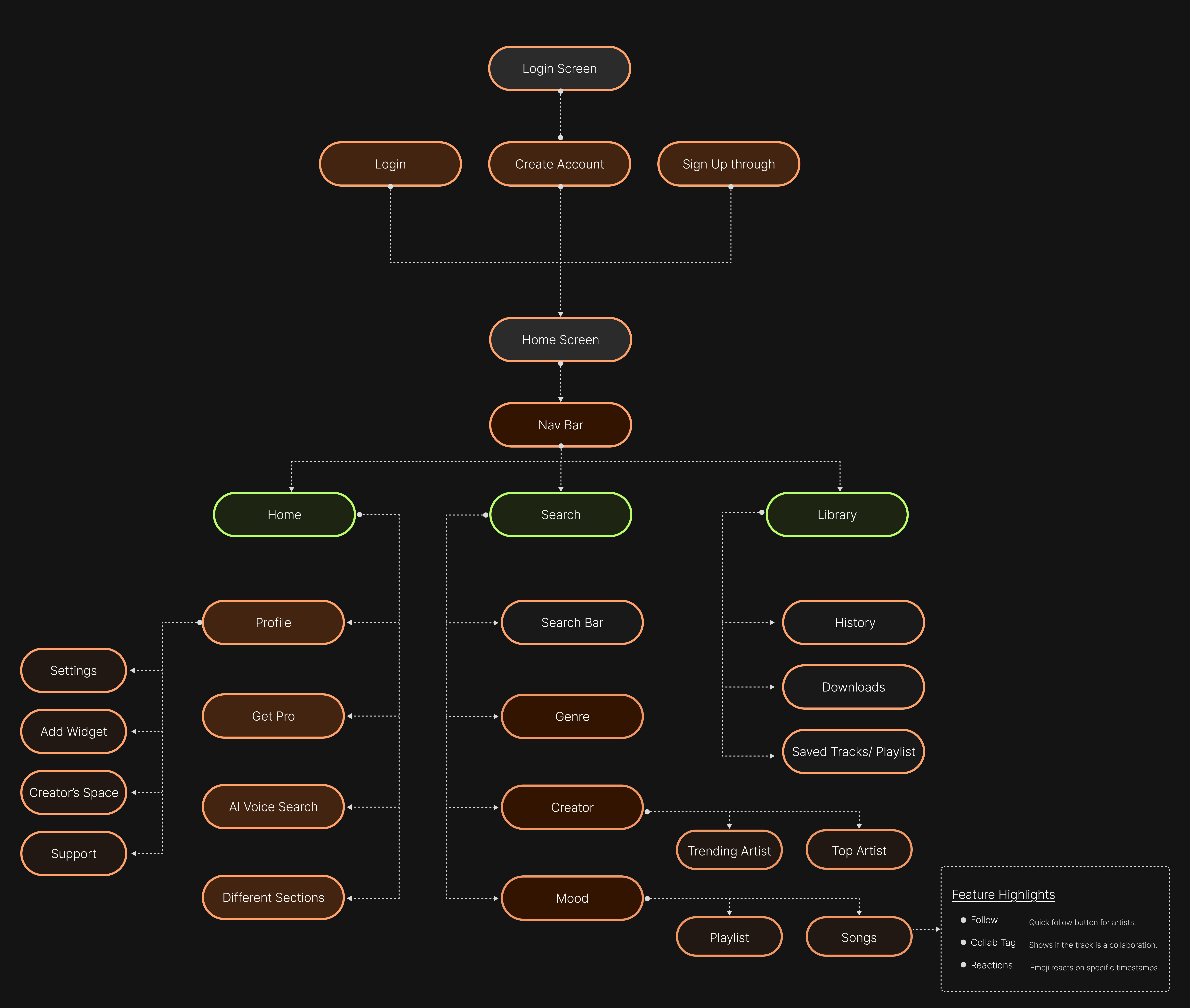
UI Highlights
A walkthrough of core screens and revamped user flows:
Home
Personalized greeting (“Hi, Snigdha”)
“A Mix for You” — mood & habit-based playlists
Quick access to Stations, Following, and Favorites with color-coded cards
Search
Toggle filters: Mood, Genre, Creator
Floating mood bubbles (Chill, Happy, Focused, Energetic)
Results displayed in bold, visual tiles with track previews on long press
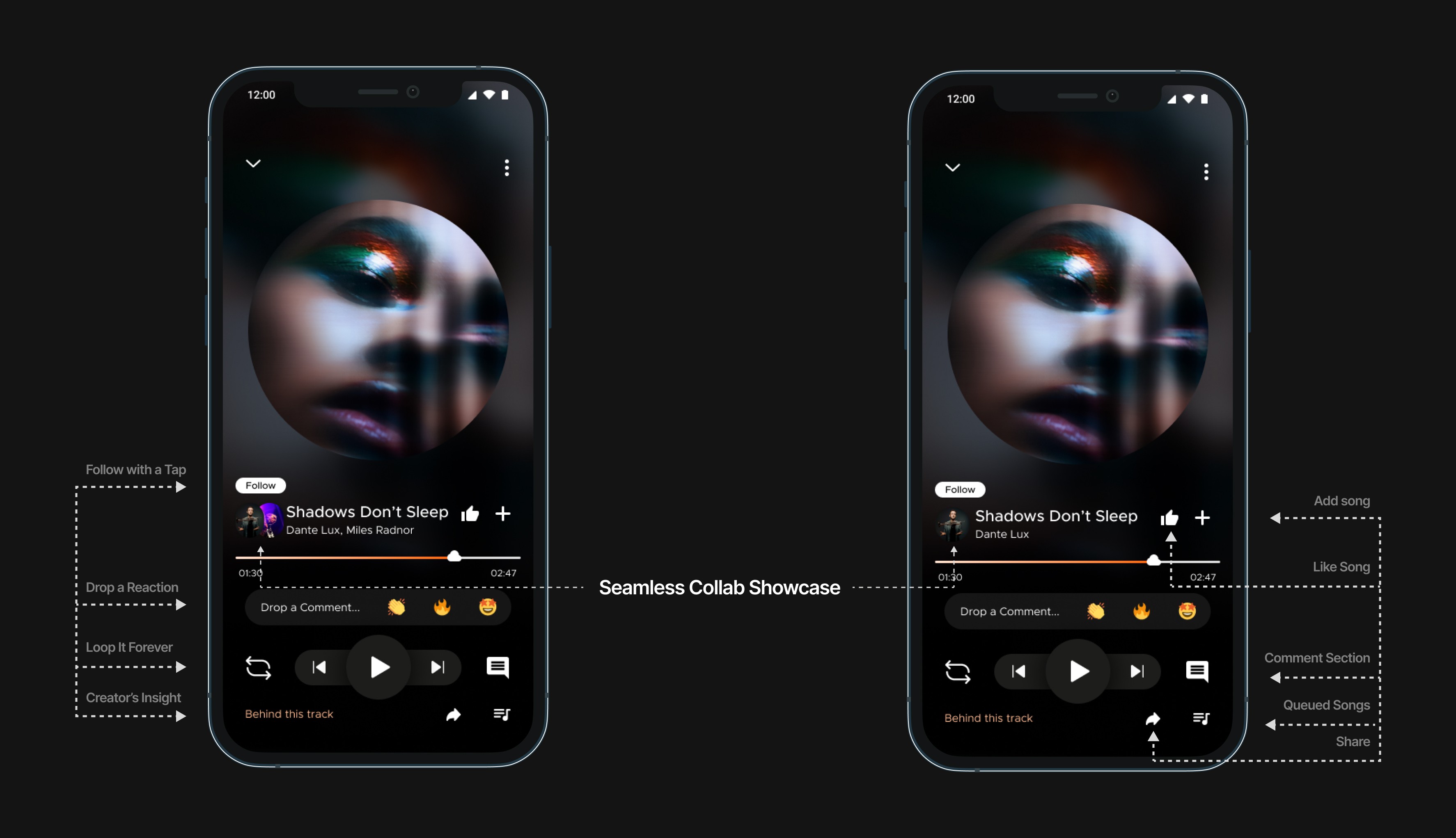
Player
Centralized glowing circular album art with a soft shadow glow
Swipe up for dynamic panels: drop reaction, comments, and Behind This Track
Sticky playback bar with intuitive gestures and multitask-friendly controls
Sign Up
Minimal, animation-supported onboarding
Microcopy for clarity and ease throughout the journey
A walkthrough of core screens and revamped user flows:
Home
Personalized greeting (“Hi, Snigdha”)
“A Mix for You” — mood & habit-based playlists
Quick access to Stations, Following, and Favorites with color-coded cards
Search
Toggle filters: Mood, Genre, Creator
Floating mood bubbles (Chill, Happy, Focused, Energetic)
Results displayed in bold, visual tiles with track previews on long press
Player
Centralized glowing circular album art with a soft shadow glow
Swipe up for dynamic panels: drop reaction, comments, and Behind This Track
Sticky playback bar with intuitive gestures and multitask-friendly controls
Sign Up
Minimal, animation-supported onboarding
Microcopy for clarity and ease throughout the journey
Research & Insights
Contextual listening matters. Users often search for music based on how they feel, not what they know
Users want personalization but not at the cost of clutter
Night users prefer dark themes, while casual users liked having the option to switch
Visual content > text when it comes to engaging young, creator-first audiences
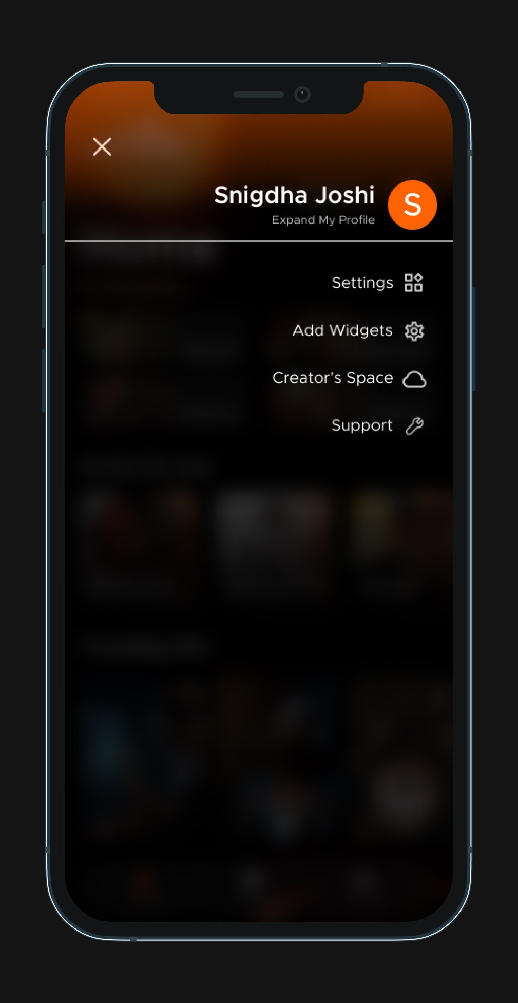
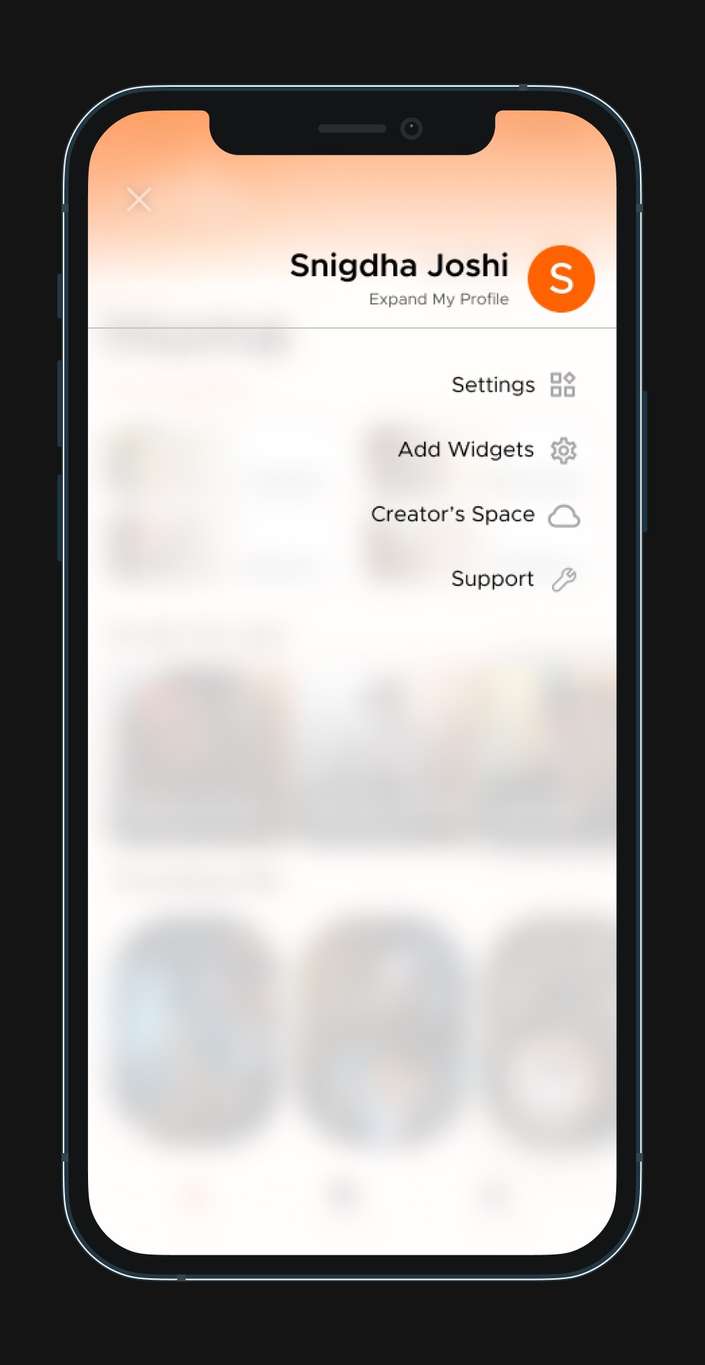
Profile Settings Screen
Profile Settings Screen
Dark
Dark
Light
Light
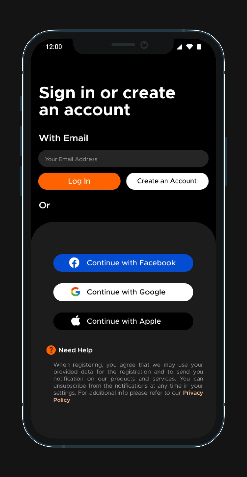
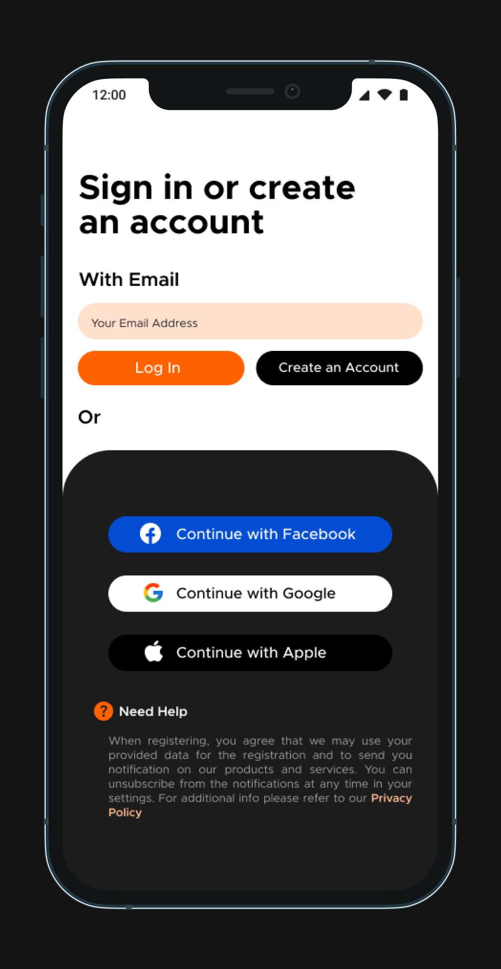
Log In Screen
Log In Screen
Dark
Dark
Light
Light
Before & After
Comparative analysis of original vs. redesigned features
Comparative analysis of original vs. redesigned features
Comparative analysis of original vs. redesigned features
Comparative analysis of original vs. redesigned features
Feature
Feature
Search
Search
Search
Search
Themes
Themes
Themes
Themes
Home UI
Home UI
Home UI
Home UI
Visuals
Visuals
Visuals
Visuals
Discovery
Discovery
Discovery
Discovery
Feedback
Feedback
Feedback
Feedback
Artist Info
Artist Info
Artist Info
Artist Info
Original App
Original App
Text-based, limited filters
Text-based, limited filters
Text-based, limited filters
Text-based, limited filters
Static Light Only
Static Light Only
Static Light Only
Static Light Only
Overloaded tabs
Overloaded tabs
Overloaded tabs
Overloaded tabs
Flat layout
Flat layout
Flat layout
Flat layout
Genre-focused browsing
Genre-focused browsing
Genre-focused browsing
Genre-focused browsing
Overcrowded interaction area
Overcrowded interaction area
Overcrowded interaction area
Overcrowded interaction area
Limited artist context
Limited artist context
Limited artist context
Limited artist context
Redesigned Version
Redesigned Version
Mood, Creator, and Genre filters
Toggleable Light & Dark
Toggleable Light & Dark
Toggleable Light & Dark
Toggleable Light & Dark
Personalized sections & clear hierarchy
Personalized sections & clear hierarchy
Personalized sections & clear hierarchy
Personalized sections & clear hierarchy
Layered cards, use of shadows and depth
Layered cards, use of shadows and depth
Layered cards, use of shadows and depth
Layered cards, use of shadows and depth
Mood-first & emotionally intuitive discovery flows
Mood-first & emotionally intuitive discovery flows
Mood-first & emotionally intuitive discovery flows
Mood-first & emotionally intuitive discovery flows
Streamlined reactions, loop, and collaboration cues
Streamlined reactions, loop, and collaboration cues
Streamlined reactions, loop, and collaboration cues
Streamlined reactions, loop, and collaboration cues
Behind This Track section for deeper storytelling
Behind This Track section for deeper storytelling
Behind This Track section for deeper storytelling
Behind This Track section for deeper storytelling
Lessons & Learnings
Reflections, learnings, and how this shaped my design thinking
Design = psychology + interface
Mood-based UX isn’t just fun, it’s functional
Accessibility doesn’t have to be boring
Iteration is magic. So is feedback.
This redesign taught me to think from feeling-first, not feature-first. And most importantly, that first attempts when made with care can start conversations that lead to better design.
Let’s Connect!
Let’s Connect!
Wanna discuss a project? I’d love to hear your thoughts and connect.
Wanna discuss a project? I’d love to hear your
thoughts and connect.
Reach Out: snigdhajoshi37@gmail.com
Reach Out: snigdhajoshi37@gmail.com
Checkout My Portfolio
Connect with me on LinkedIn
Connect with me on LinkedIn
Thank you for scrolling all the way!
Thank you for scrolling all the way!
Made with Figma & Framer• Inspired by Madifedo Yum • Images via Unsplash & Pinterest
Made with Figma & Framer• Inspired by Madifedo Yum • Images via Unsplash & Pinterest
© 2025 Snigdha Joshi — Designed for educational and portfolio purposes.
© 2025 Snigdha Joshi — Designed for educational and portfolio purposes.